Overview
Dress4Now is an integrated online fashion shopping application that optimizes the online clothing shopping experience.
Time: March - May, 2018
My role: UX Researcher, UX/UI Designer
Instructors: Catherine Batacan, William Tyner
Highlights: six user interviews, 10 usability testing (four for low-fi, six for how-fi)
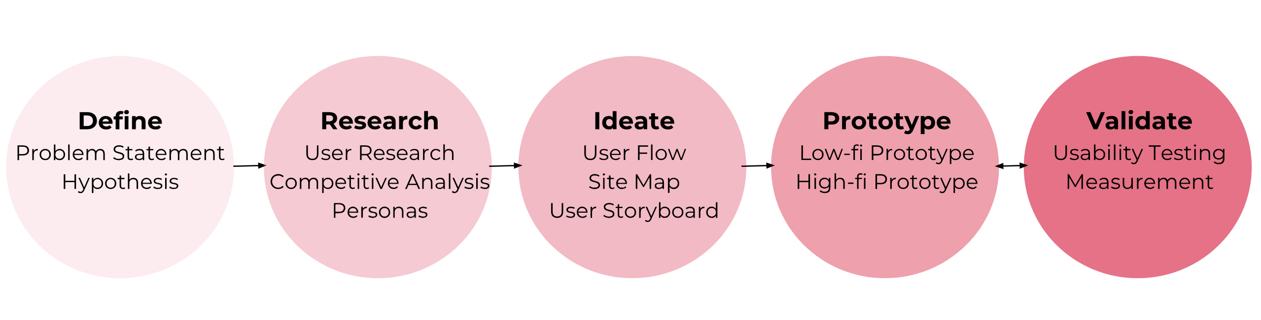
Research methods: In-person Interviews, Card Sorting, Comparative Analysis, Affinity Diagram, Prototyping, Wireframing, Usability Testing
Tools: Sketch, InVision, Photoshop, Illustrator, Premiere, Trello
Background
Remember the last time you spent a day in a department store, grabbing clothes and roughly counting the number before an assistant to get into the fitting room? Young female friends around me always complain they didn't have time to go shopping and their wardrobes always lack a piece of clothing. But the truth is that they're easily attracted by online promotions to open up a fashion app browsing for a whole night.
According to a report by Shopify in 2018, revenue and revenue per user (ARPU) of digital clothing merchants are projected to grow both worldwide and domestically in five years. The U.S. ecommerce fashion industry is expected to grow 8.8 percent while 8.7 percent in Europe and 14.1 percent in China.
The reduced digital barrier provided us with a more convenient way to shop. However, as ecommerce reshaped how customers interact with the items in fashion industry and created a totally different experience, problems emerge. The increasing return and exchange rates indicate the space to optimize user experience with online fashion retailers.
I targeted my users as young femalel professionals aged 18 to 35 as they make up for the majority of online fashion shopping customers. To address the problem, I randomly chatted with my friends falling into this category and roughly came to the first-stage statement as below.
Problem Statement
Young female professionals need a way to get more details of the clothes online because it will help them get a perfect fit.
Young female professionals need a way to get an organized list of online clothing products and customized recommendations because it will save their time.
Hypothesis:
We believe that by creating a function that allows customers to virtually try clothes on for young female professionals, we will achieve offering the best fit for them.
We will know this to be true when we see higher conversion rates and lower return rates.
User Research
I conducted six interviews in total. Three of them were my friends and three were female consumers I interviewed at department stores.
Key interview questions
Research Findings
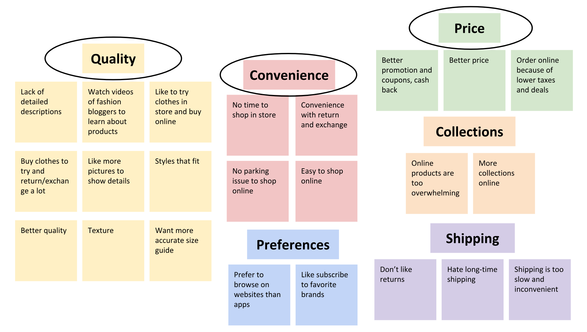
I used affinity diagram to analyze all the insights and findings from my user interviews. Overall there are three main painpoints users have with online clothing shopping.
Competitive Analysis
With the research findings in mind, I conducted the competitive analysis by listing the featues of competitors. Bascially there are three types of competitors based on my research.
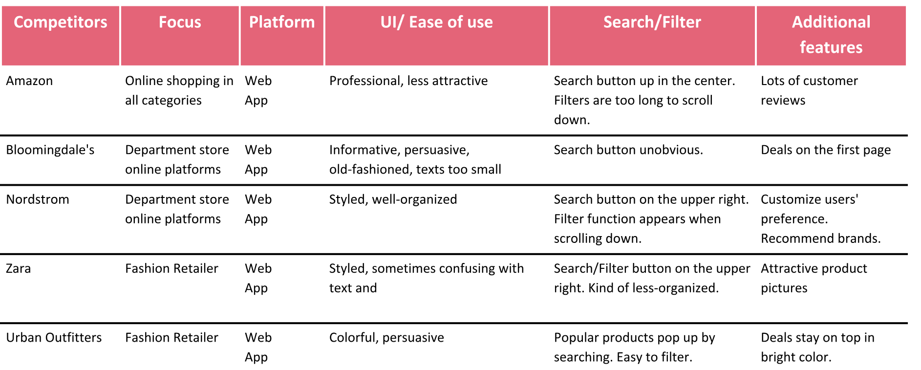
Although they do not focus on fashion retail, they almost have everything users in need of and the habit of shopping in other departments sometimes triggered users to search for clothing items. They're professional in creating an easy path for people to shop, but not customized enough for clothing shopping.
They typically extend their offline shopping experience to the online platform. While they're expert for its large collection, their digital platforms actually lack some dedicated efforts with UI/UX designs.
They usually offer a lot of deals and create an online community. They have their own websites and mobile platforms that are well-built. But the limitation is that users have to switch if they don't want to shop in a specific brand.
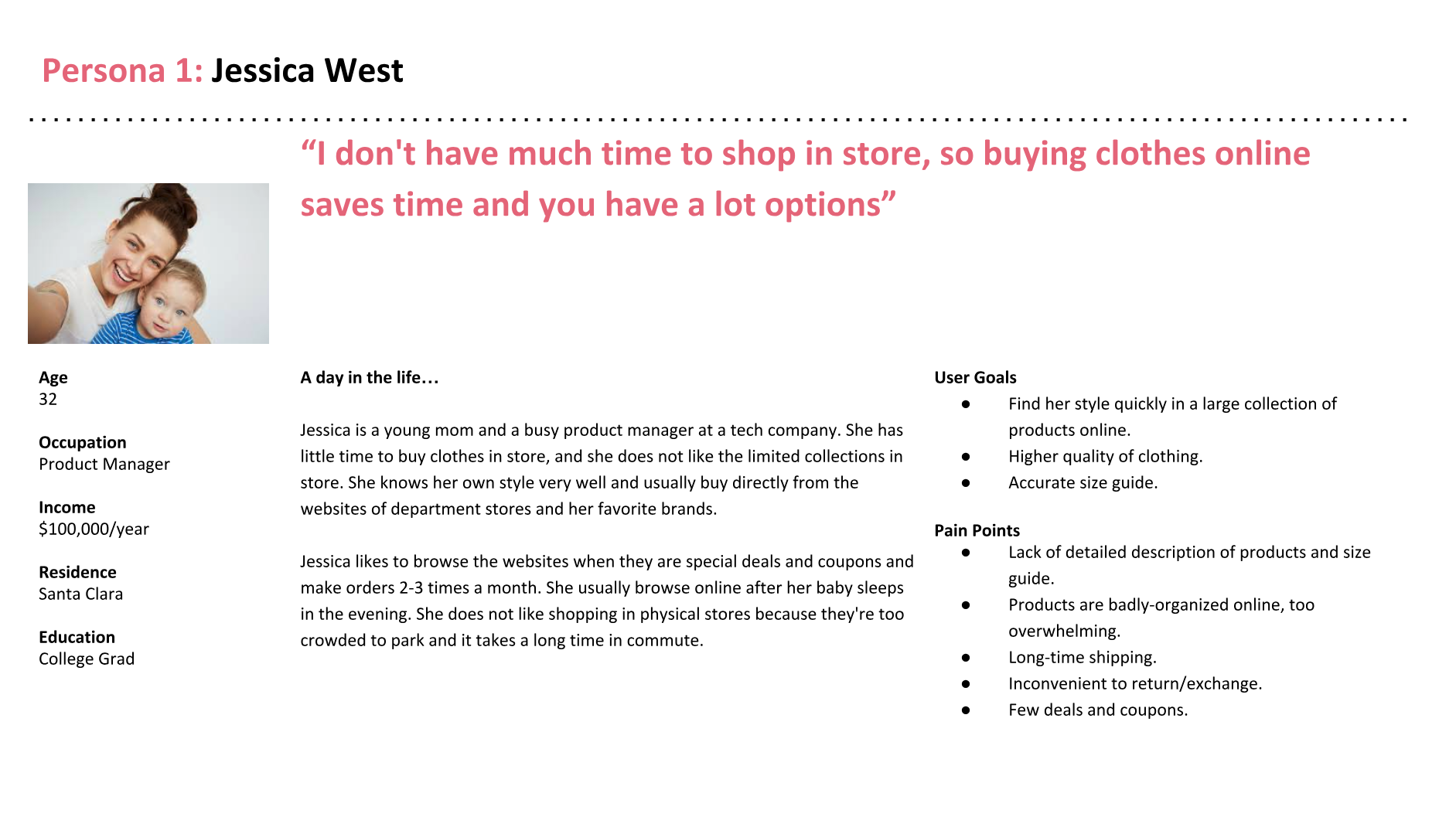
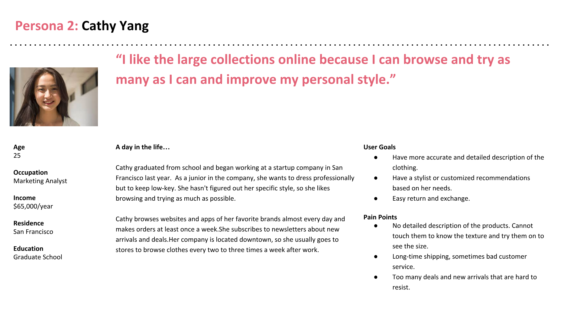
Personas
Based on my research and analysis, I created two personas and revised the problem statement and hypothesis.
Revised Problem Statement
Young female professionals need a way to get more details of the products on online fashion platforms because it will help them have a better knowledge of the quality of products and make reasonable purchase decisions to get perfect fits.
Revised Hypothesis
We believe that by creating a function that allows customers to get access to the details of the clothing products for young female professionals, we will achieve offering the best fit for them.
We will know this to be true when we see higher conversion rates and lower return rates.
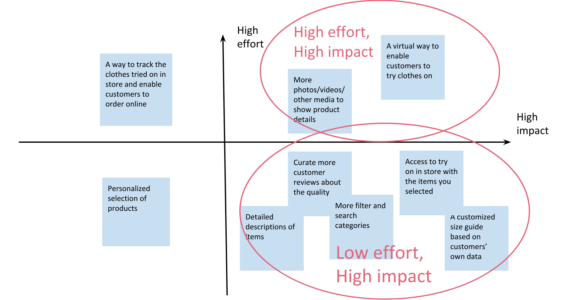
Feature Prioritization
I brainstormed many approaches to solve the problem, and prioritized them using the "effort-impact" matrix. Starting from the "low-effort, high-impact" quadrant, I also tried to tackle some of the "high-effort, high-impact" ones.
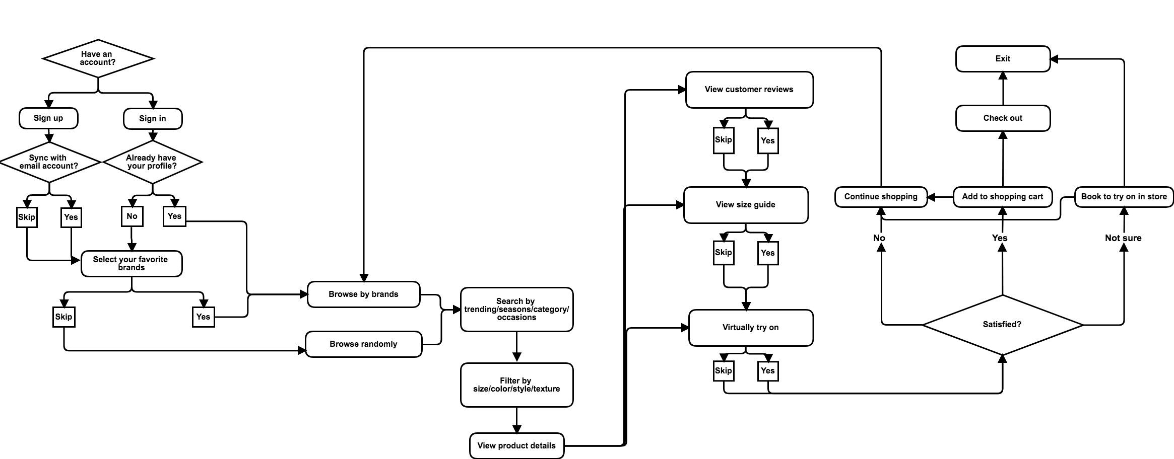
User Flow
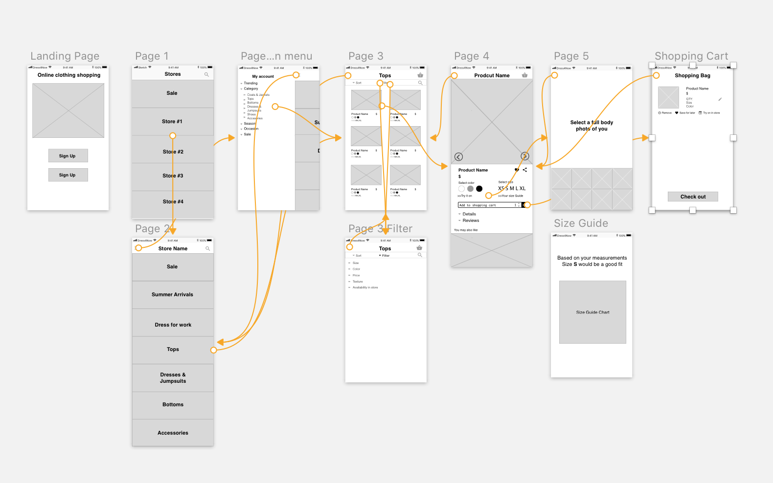
Creating a user flow enabled me to think logically and integrate all the elements I already had into a happy path. It was much harder than I expected to draft the first flow, partly because of the tedious sign-up steps and the navigation across different brands.
After seleveral times of revision, I finally came to the one below. It's close to a normal online shopping path, but I added three main features innovated to optimize the path.
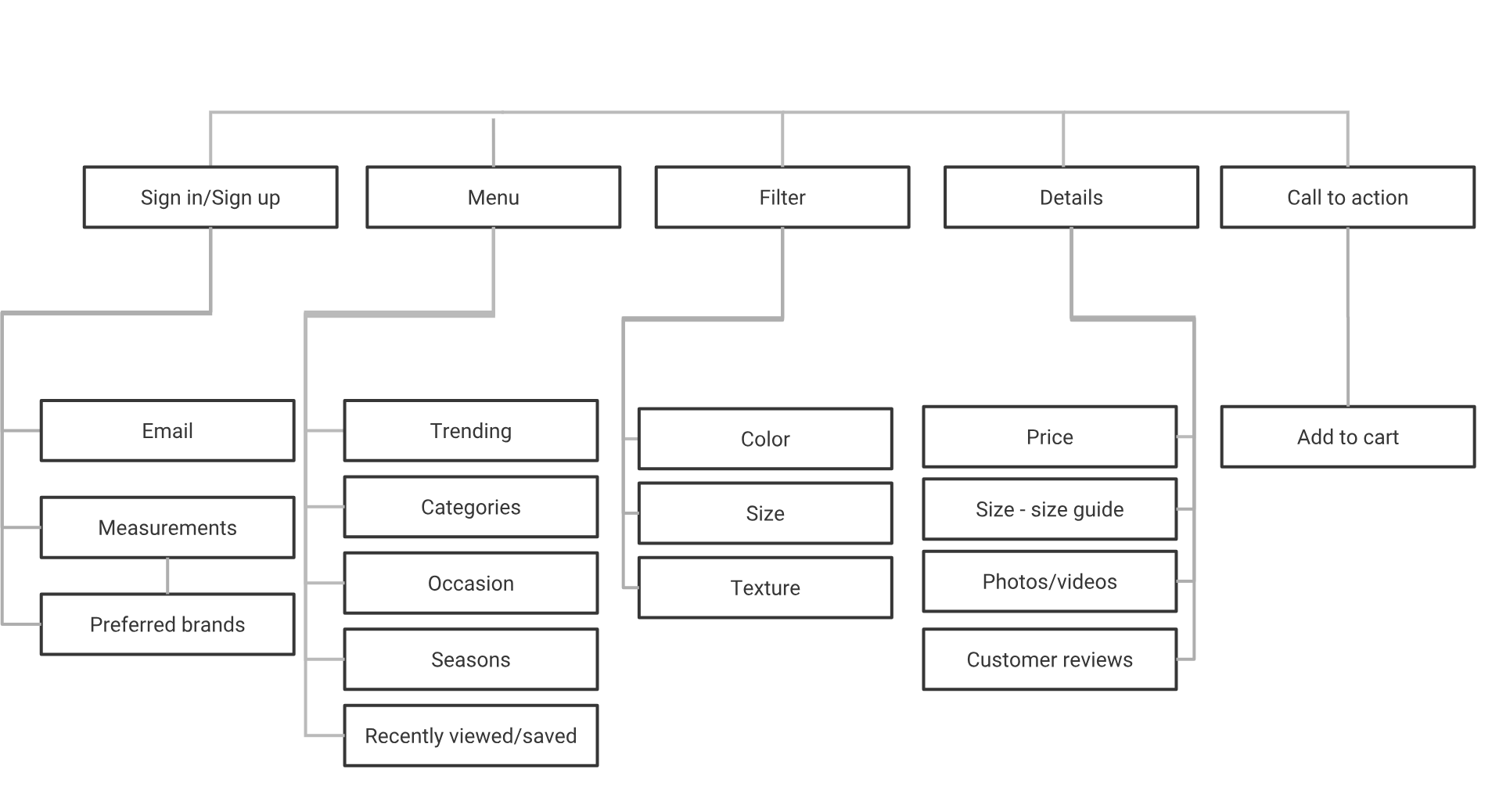
Site Map
After some card sorting experiments with potential users, I landed on the site map to lay out the information my product would contain. There was no big surprise from the card sorting results as they all expected in line with a normal fashion retailer platform.
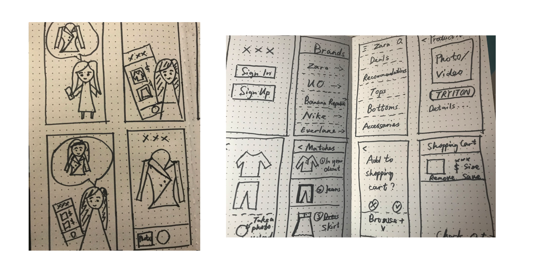
User Storyboard
An effective way to progress was to sketch out the scenarios of how a potential user would interact with my product and what the main screens would be. (Please excuse my bad drawing!)
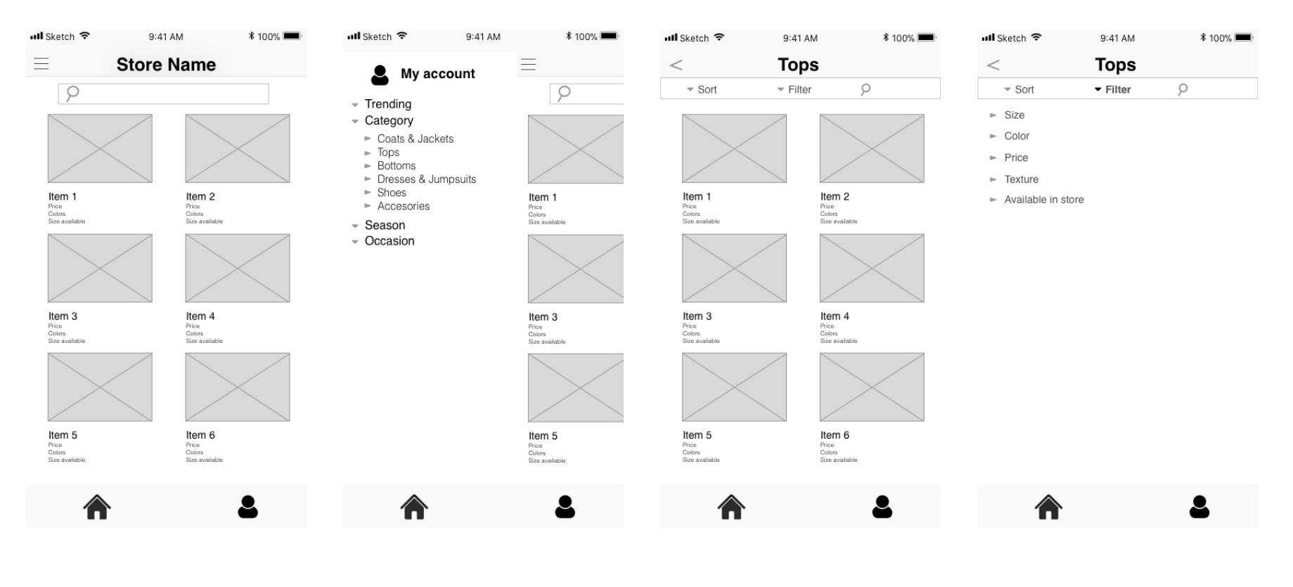
First-stage Prototype & Usability Testing
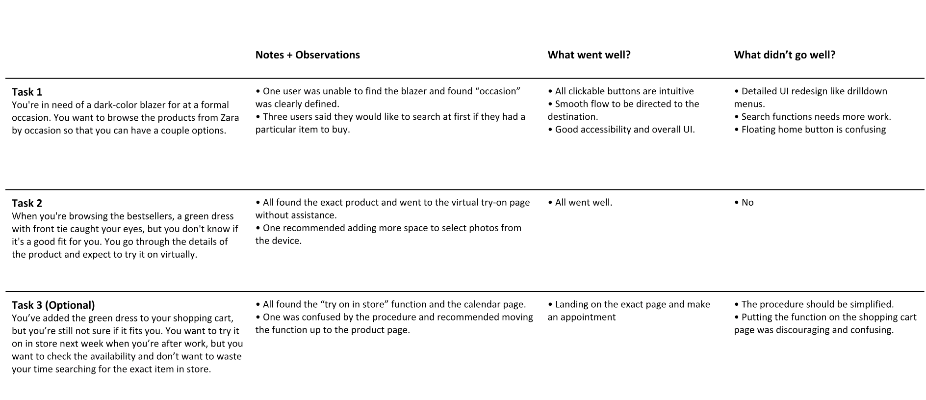
I conducted my first round of usability testing with four users and two tasks with the four main screens at the very first stage.
Overall the usability testing turned out well, but people expected the UI to be more intuitive and more features added to create an end-to-end path.
Low-fi Prototype
With the insights from first usability testing, I expanded the four screens to more for a more comprehensive low-fi. I linked screens and buttons to show the interaction.
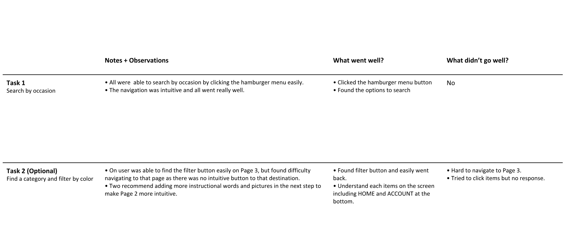
MDP Usability Testing
I continued the usability testing all the way along the process from low-fi to high-fi. Once the main functions were ready, I began to test ignoring the unfinished UI. I found this approach was more effective and flexible than testing after everything is done as it took me less effort to revise.
I've done six usability testings in total, with three tasks . All were offline so that I was able to ask their feedbacks promptly and recorded the whole process.
Thanks to the testing, I realized some barriers that I failed to see as an insider, like the floating home button, the placement of "try on in store" function and some detailed UI elements.
Final Prototype
For the final prototype, I've made three main revisions after the usability testings.
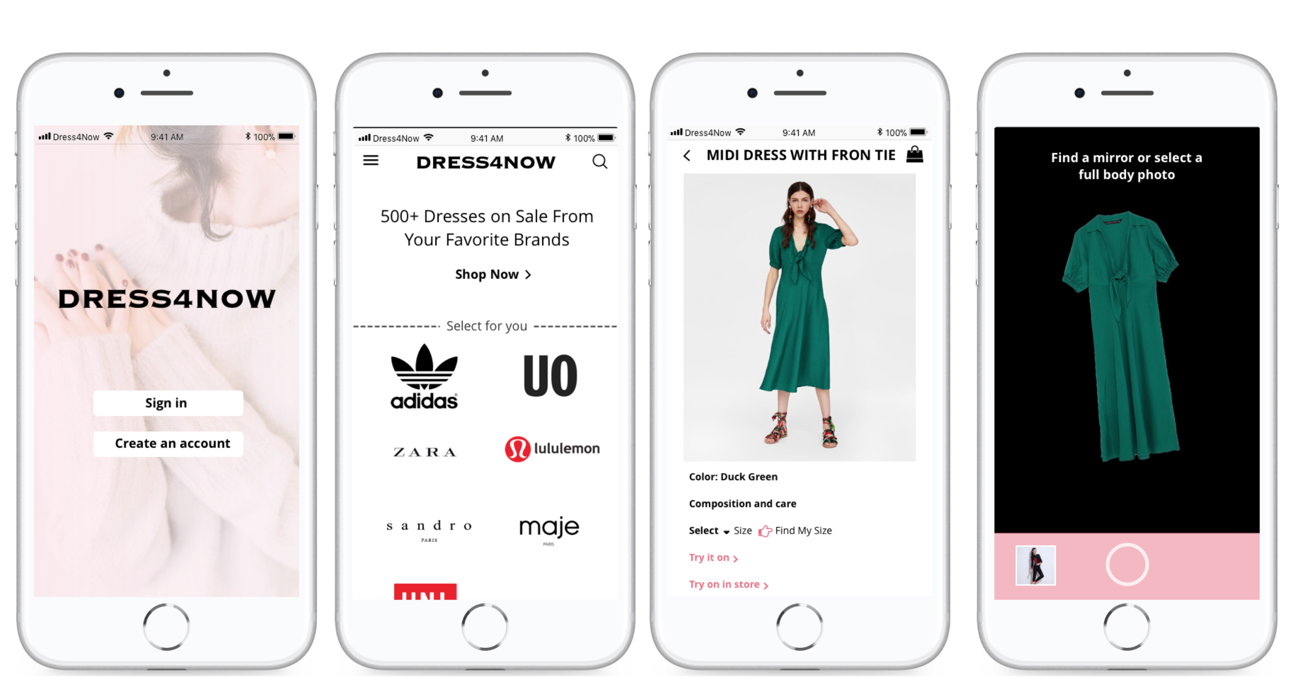
The sign up stage was one of the most challenging parts as I tried to get more preferences from users without bothering them. I revised the UI design to prioritize the hierachy of each page by moving the "back and step" button to the top and making the font weight smaller. To keep users more engaged, I also added pop-up windows in later steps before they check out.
With so many color patterns experimenting with accessibility and branding, I finally decided to keep the main pages black and white as most online fashion retailers do. The biggest challenge is that the information of clothing items is too colorful, thus having my own color is likely to make it too overwhelming.
"Virtual try on", "Cutomized Size Guide" and "Try on in store" are the three main featues I created for this product. In stead of putting "Try on in store" before the procedure of checkout, I moved it up to the main product page based on the user feedbacks. I also revised the placement of these features bu slightly reorganized the content structure from Zara's original design.
InVision Prototype
Learnings and Challenges
As I've gone through the whole process of a UX design in this project, the biggest takeaway for me is to get foot in each stage of the entire UX design, especially some of the procedures I was not familiar with before.
Different from previous projects I've done which already have existing products and problems, the project required me to come up with my own problem statement at the beginning, which was the biggest challenge for me. As I was so perplexed at the beginning, I forced myself to get out of home, observe and ask people as much as possible every time when I was stuck in the process.
This method was also significant in usability testing. It was easy to be unsatisifed with your design but had no idea what did'nt go well. Asking people for feedbacks, either randomly or officially, would help.
During this project, I've read Don't Make Me Think by Steve Krug and applied some of the methods discussed in the book. It comprehensively talks about almost everything in web design in a casual way.
Next Steps
Due to the time limit I just tackled the top pain points but didn't have enough time and efforts to solve other problems. The next step is going back to my research findings, trying to ideate solutions for other pain points and validate them along with my current prototype.
After that I will consult with engineers about how to realize those features, and how much efforts would be involved. Based on my research, the "try-on" feature would involve facial recognition system based on machine learning, and the "customized size guide" would require more data to make it precise.
Meanwhile, as I'm really interested in fashion industry, I'm also keeping track of the design trends in this industry, including the recent online product updates from fashion retailers, and other applications aiming to optimize fashion shopping experience like Amazon Fashion and Stitch Fix.